This week we were focusing on typography. I took some time to browse websites via sites like One Page Love and CSS Awards, taking particular notice of the typographic styles used to portray personlaity and clearly display content.
Taste Cooking
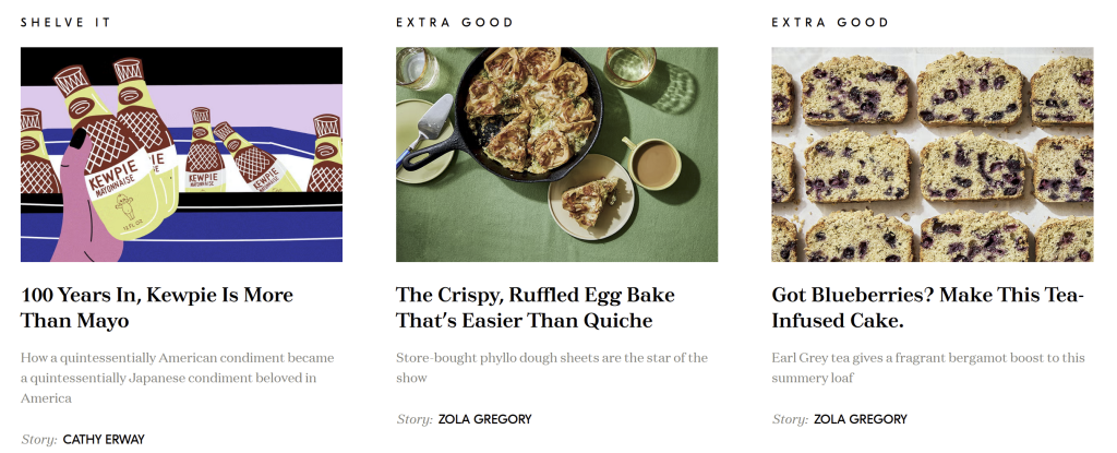
The type on the taste cooking website is very pleasant on the eye, and visually clear. It uses the font ‘tuscar-deco’ for the headers which is a bold, clean serif font. And ‘domain-text’ for the body text, also a serif font but very modern and features curved serifs giving it a subtly fun personality whilst keeping it readable.
The article previews pictured above are effective as they use the contrast with the clean, bold and black header over the smaller body text in a lighter colour as it is just a preview it doesnt shout out at the viewer but sits back behind the key text that the user would be skimming.
The element that really stood out to me on this website is the use of the third typeface ‘gt-eesti-pro-display’ for the nav bar as well as subheadings displaying the type of the content.

I particularly like their use of uppercase styling and letter spacing (5px in this case) to stsnd out against the other texts and let it stant out in its own right whilst not be too overpowering. The spacing gives it a lot of breathing room and allows it to appear much lighter. Whilst i realise this wouldnt work in body text, i do think this website provides as an example of how letter spacing can be effective.

I also really like the use of a drop cap for the main text of their articles. It’s a clean, modern variant of the traditional drop caps which are a nod to traditional printed articles but adjusted for the web. It helps to guide the users eye to the start of the text, improving the user experience and the flow of the page.
Moomin

The moomin website is full of personality and is instantly recognisable, even at a glance. This is due to the heavy use of their very own ‘moomin font’ as used in the logo with the sans serif but sharp letters. This font is used for most of the headers which makes them pop out clearly against all the body text.
The body text is all in the sans serif ‘mikado’ font which is rounded and bold – fun and bubbly, just like the moomin characters and world.
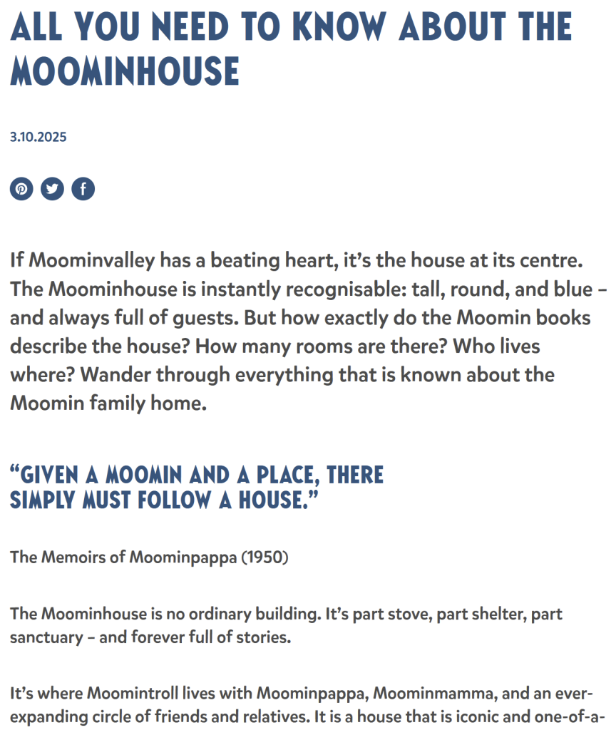
A subtle difference in text weight as well as colour, is used between the article preview header and body text. This is also used in the articles, going from the first paragraph in 500 weight versus 400 weight for the rest of the article. I think this helps to guide the users eye towards that first paragraph, improving readability as well as helpijng to break up the text. I do however think the use of ‘moomin font’ is slightly overdone and actually takes away from the strength of it.
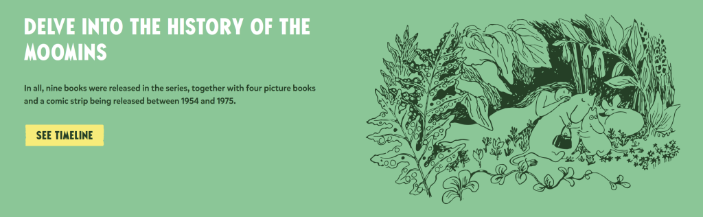
Their use of colour in the text helps to seamlessly integrate it within the site, in some places they have used the same colour for the illustrations as they have main body text, allowing them to work together smoothly and appear visually calm.
Data for Woman AI
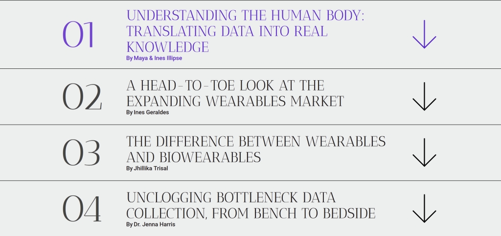
I found this website through awwwards.com. It really stood out to me for the use of ‘Antic Didone:Regular’ for it’s headings. This font gave the site a very elegant feel due to the contrast between thick and thin strokes and tall x height. Its feminine, yet big and bold. Perfect for the site about womans health research.

The classic ‘roboto’ font used for the body text hugely contrasts the header font, they balance each other out and make the site not too visually intense. This site is very text-heavy so the typographic styles and layout are extremely important to ensure readability. In some places they have used collums, this gives it a bit of a newspaper feel as well as breaking up the text.
This site succeeds in portraying the themes of its purpose whilst also enhancing the readability experience in a proffesional and elegant style.
