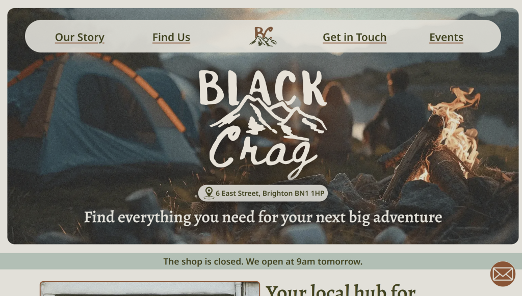
Original Site
https://kirstenalice.uk/design-for-web-content/small-business-website/index.html
Since creating the Black Crag website, my understanding of web design has developed. In particular, when it comes to accessibility and SEO considerations, there were many changes I wanted to make to the website.
HTML improvements
Some changes need to be made to my HTML to improve its semantics, which in turn will improve its accessibility as well.
My code was not valid. For the previous hand-in, I ran out of time to validate my code. The issues that came up from the W3C HTML validator were a lack of spacing between attributes and a lack of headings for sections.
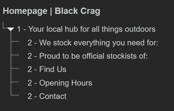
My HTML also lacked correct heading levels, skipping some levels and using the wrong ones in places. Some headings were incorrectly nested inside irrelevant headings.
The use of <section> was overused in my markup, where another option would add more semantic value.
Design
The main issue in my original design was with the hero section being too large, and there was not enough information provided above the fold. Because of this, it is not clear to a user that they can scroll beyond this section.
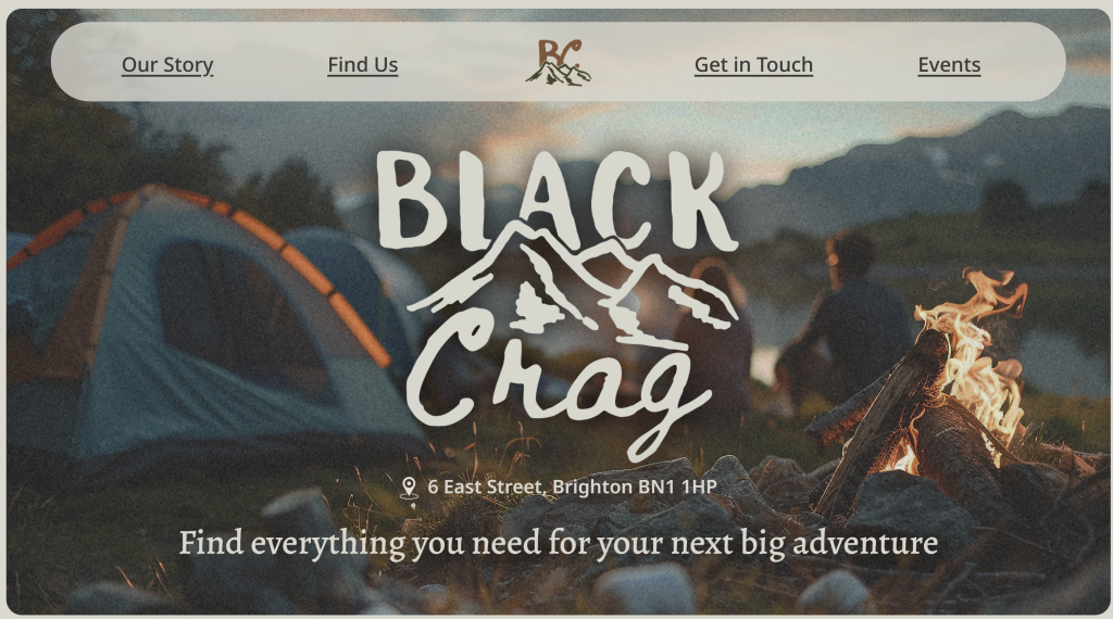
This section also lacks readability, in particular with the address over the image.
Accessibility
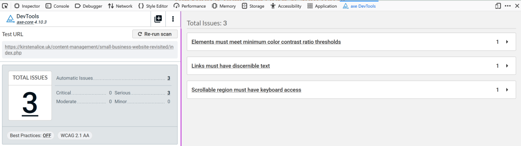
Upon learning more about web accessibility from the ‘Inclusive and Sustainable Web Design’ module, I discovered some elements could be improved in these areas for my small business website, too. I used Axe DevTools to review the overall accessibility of my site. The issues that arose were with the colour contrast, link text and keyboard navigation.
Improved Site
https://kirstenalice.uk/content-management/small-business-website-revisited/index.php
Semantic HTML
Heading Levels
I reviewed my headings throughout all the pages of my site and ensured there were no instances of skipped heading levels or irrelevant nesting. Previously, I was using h3’s when h2’s were more appropriate, as they were not relevant to the previous h2.

Sections
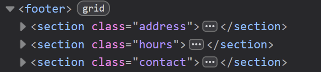
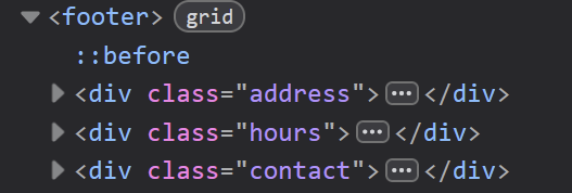
I reduced my use of <section> and ensured I only used it where appropriate. In some cases, I still felt <section> was semantically correct as it contained grouped content with a heading, but in some instances I switched <section> to <div> as the grouping was intended more for visual purposes using CSS.
Validation
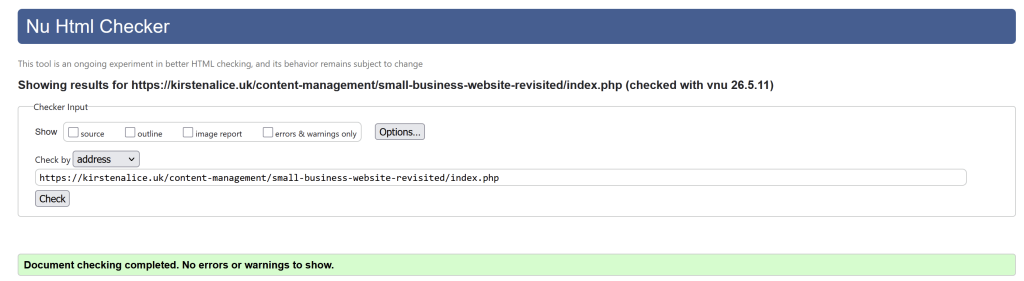
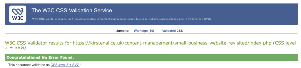
I made sure to validate my HTML and my CSS after completion to ensure there were no issues.
Design Improvements
The section of my site that I redesigned the most is the hero section. This is the first thing the user sees, so one of the most important parts of the site; the design needs to hook the user and encourage them to keep scrolling. Before, the hero image took up too much of the viewport, and it took away from the actual information on the screen.
I shrunk the section down to 80% of the viewport height.
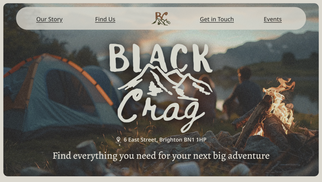
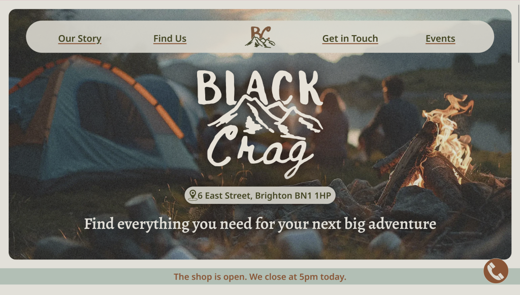
To improve the readability of elements on the hero section, I gave the address a background colour and increased the weight of the tagline text.


Having the address visible on the landing viewport was important for clarity of the shop being a physical store and encouraging users to visit in person. I also increased the opacity of the navigation bar to improve the readability of this over the image.
Link States
I made sure every link had all five link states to improve the clarity for all users. I made sure the hover focus state was very bold and visible on all backgrounds by using a contrasting colour.


I also made use of PHP to highlight the current page to make it clear to the user which page they are on

User Experience
After showing my website to friends/family to test, the feedback I received was that it took too many steps to get in touch with someone, and some elements looked like links but weren’t.
Sticky CTA button
I added a sticky button to the corner of every page, which stays there at all times for users to call the store. On hover, ‘call us’ pops out next to it, making it clear that it is a clickable element
In my user research, I discovered how important it is to talk to a real human as easily as possible.


Links
Any element that relates to content on another page, I turned into a link to make it as user-friendly as possible. So the address on the hero section and the ‘find us’ in the footer both lead to the ‘find us’ page.


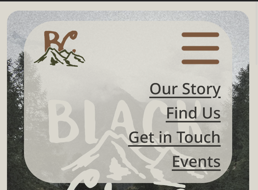
In the mobile navigation menu, I added another home link. In my user testing, someone said that it wasn’t clear that the logo was a link to the homepage.
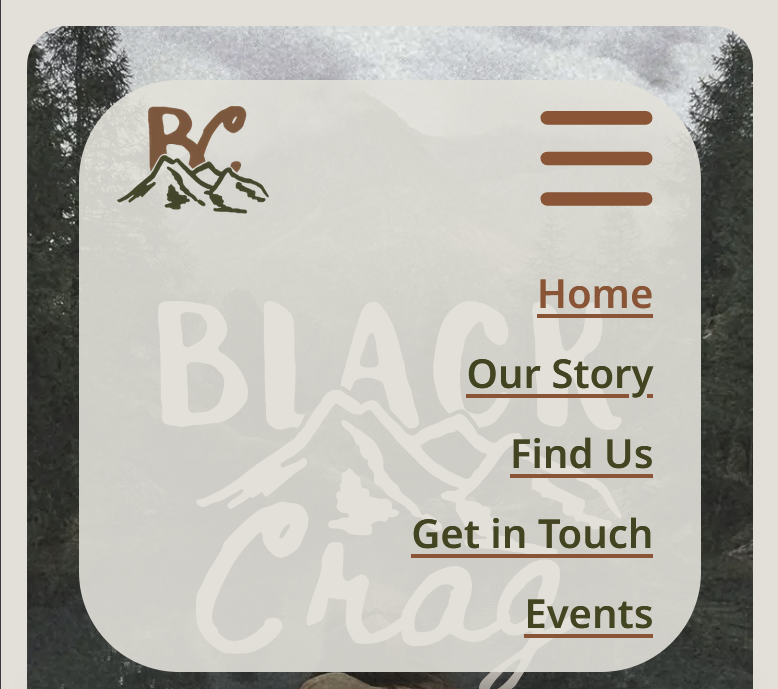
404
By creating a custom 404 page, the user will never feel lost on the page if they reach an error, the website remains a cohesive experience and provides an easy way to make it back to the homepage.
https://kirstenalice.uk/content-management/small-business-website-revisited/index.phpgvbae
Accessibility Considerations
Colour Contrast
I tested the colour pairings using the Colour Contrast Analyser and adjusted the colours to increase the contrast and readability until they passed at least WCAG AA.
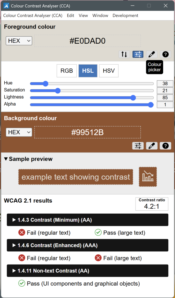
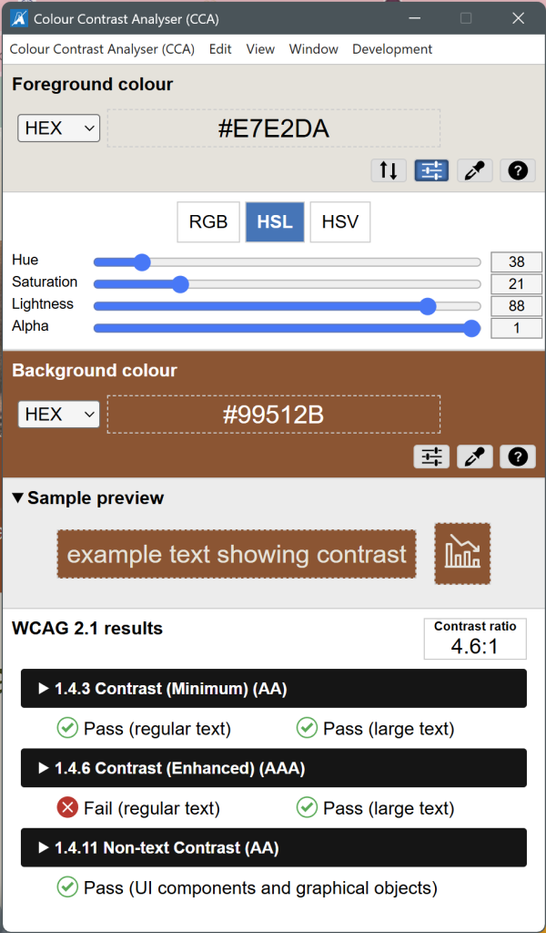
The brown on blue colour pairing was flagged by CCA, so I changed this text to dark green, which is a lot clearer, especially for those with low vision.


Accessibility Statement
I added an accessibility statement to my site, linked to from the footer.
https://kirstenalice.uk/content-management/small-business-website-revisited/accessibility.php
Keyboard Navigation
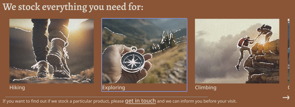
Upon testing the keyboard navigation with the tab key, I discovered the horizontal scroll on my homepage was impossible to focus on and scroll through for keyboard users. I adjusted the tab index in the HTML so that the <li> were focusable rather than the <ul>.

Target Size of Interactive Elements
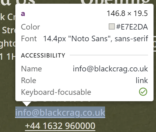
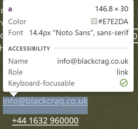
Axe DevTools also flagged that some of the interactive elements had too small of a target size. I increased the padding around these link elements to make the clickable area larger in size. This will make it easier for users with physical impairments to activate them accurately.
ARIA
After further research on ARIA markup, I refined my use of ARIA to add semantic value where needed for accessibility purposes.

After all my changes, I checked every page of the website using Axe DevTools as well as the WAVE accessibility tester.
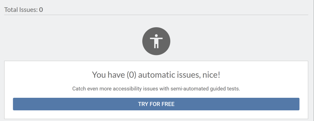
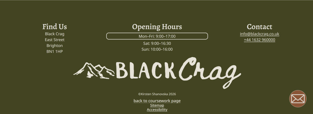
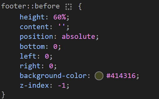
Whilst Axe DevTools came back with 0 errors, WAVE still flags the very low contrast on all elements in the footer as the background was an image, so it wasn’t registered by this tool.

For users on phones with low signal, these images may not load straight away, so I created a pseudo-element behind with a solid colour as a backup for these users.
Sustainability & Page Speed
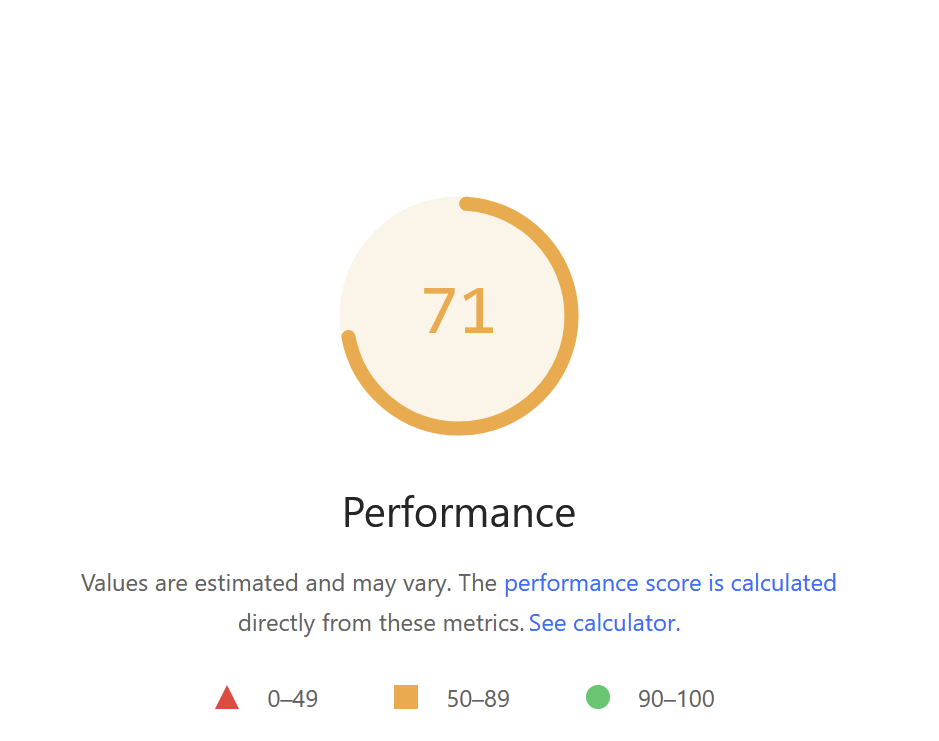
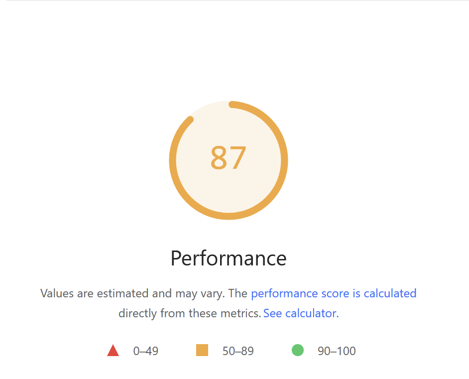
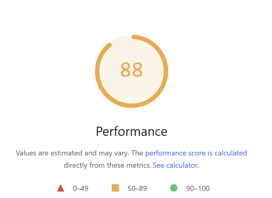
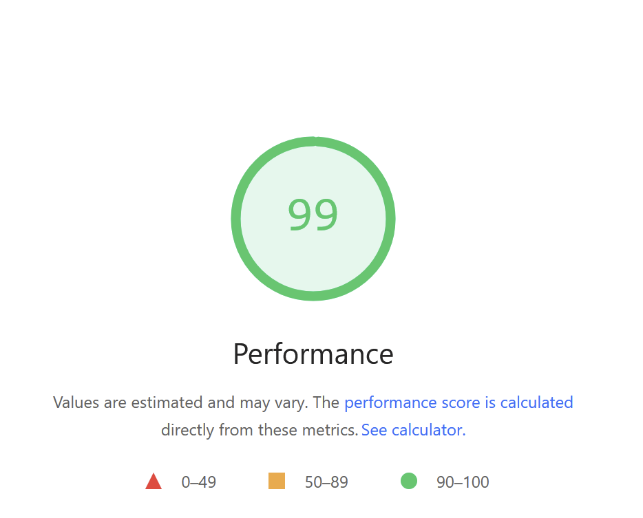
I tested my site using Page Speed Insights and used some of its suggestions to increase the performance score as much as I could. By improving this score, my website will be faster to load as well as use less energy, improving the overall sustainability.
Image Optimisation
The largest negative contributor to my score was the large image files. I optimised all of my images using the Squoosh tool and turned some into SVG’s where appropriate
Font Files
I reduced the download size for my Google fonts by only downloading the weights and styles of each font that I actually used.

Behaviour Layer
I made use of the behaviour layer to enhance the user experience. With JavaScript, I changed the text in the banner to say the current status of the shop and how long until it closes/opens. This banner sits at the top of every page so that the user can instantly see this at all times when on the site, making them more likely to visit the store as they are always aware of how long they have to visit it.

I also added a script to highlight the current opening times in the footer so it is instantly clear which are the current times, reducing the time for the user to work this out.

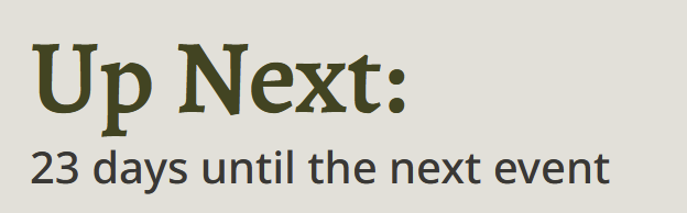
On the events page, I added a countdown to the next event at the top of the page. If a user knows exactly how soon or far away an event is they will be more likely to book onto it.
I wrote another script to change the CTA depending on the status of the shop. So when the shop is open, the phone lines are open, and you can call. When the phone lines are closed, the user is instead given the option to send an email.

SEO
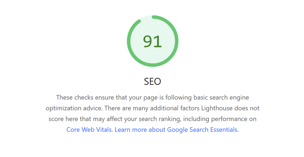
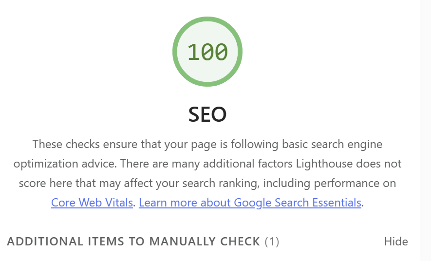
Using PageSpeed Insights’ SEO checks I found some things I could improve on and boosted my score to 100.
I created a robots.txt file to ensure robots crawling my site would find the most valuable content.
https://kirstenalice.uk/content-management/small-business-website-revisited/robots.txt
I also created a humans.txt file.
https://kirstenalice.uk/content-management/small-business-website-revisited/humans.txt
Sitemap
And a sitemap.
https://kirstenalice.uk/content-management/small-business-website-revisited/sitemap.xml
Description meta tag and title
I made the title more descriptive of each page and added a meta description tag to help search engines to understand the content better and show it in appropriate search results, providing users with enough information to want to click on the site.

Geolocation
I also added a geolocation to the <head>. This is important as the shop is in person, it will help to show the website to users who are in that area or searching for something in this area.

PHP structure
As my website grew, I turned it into a modular system using PHP includes. Having just one file for the header and footer became more efficient the more I added and changed these files.

Conclusion
My improved small business website aims to provide a cohesive and accessible experience for all users, whilst maintaining the goal of getting the user to visit the physical Black Crag store in Brighton.
