Monte Café
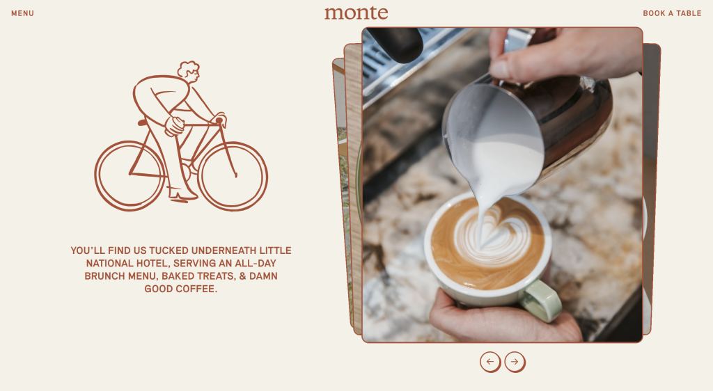
Monte is a café in Newcastle, Australia. Their website really stood out to me for being so minimal whilst working so well to portray a fun, friendly personality.
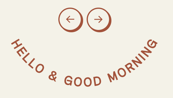
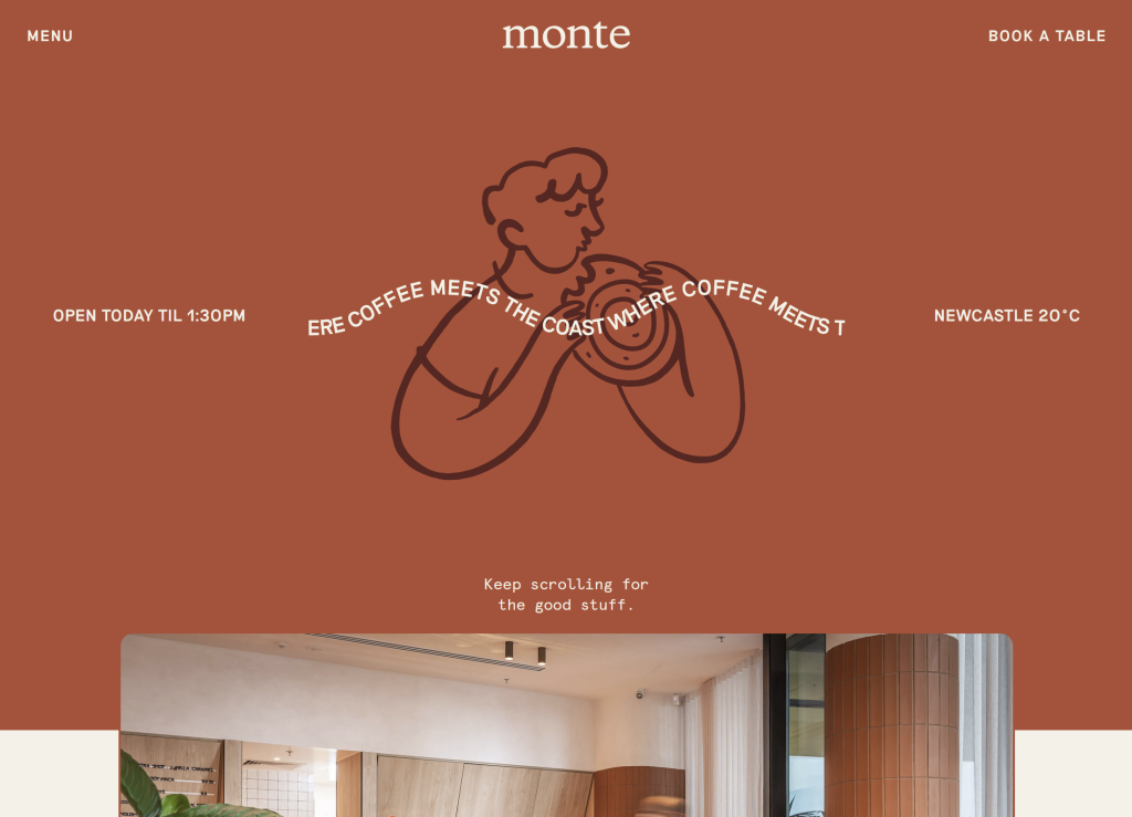
It does a great job of mimicking the experience that you would feel when visiting the café itself. it does this with the use of subtle design features such as this half-hidden smiley face that some users might not even notice but even for them I think subconsciously gives them the ‘service with a smile’.
Another way their friendly customer service is portrayed in the user experience, is in the way their text is spread out across the page as you scroll which makes it feel very natural and almost conversational. I think that’s where a lot of restaurant and café websites go wrong – big blocks of text about the history and family of the company as you first land on the page. That’s just not what the user of one of these websites is using it for and its unlikely to be read.
The designer of Monte’s website really understood their target audience. Users will interact differently with a cafe’s website than they would an informational research website.
A long side this, the call to action button ‘book’ is right at the top at all times and not lost amongst other less important buttons.

I particularly like how seamlessly integrated the menu is within the website; its as much a part of the page as the images and description is. This is the main reason anyone would go to a cafes website I think so is very important. It provides a much smoother experience than downloading and opening a menu pdf.

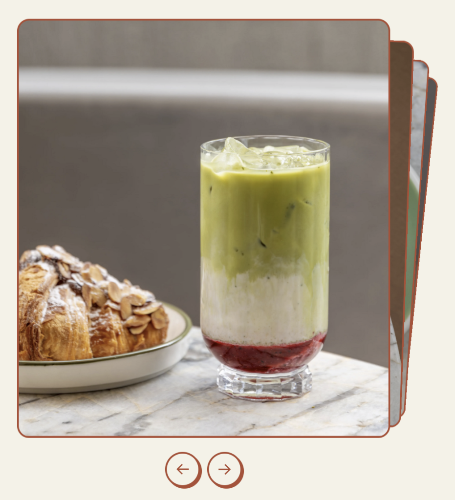
The majority of the website makes use of a limited colour pallet consisting of just a creamy background colour and a primary red colour (with the occasional darker red element as well). This makes the photos that they’ve used really pop out of the page as it’s such a bold contrast. They don’t feel out of place though, as they use a fine red border around each image which feels so basic but I think makes all the difference with keeping the brand identity present throughout.
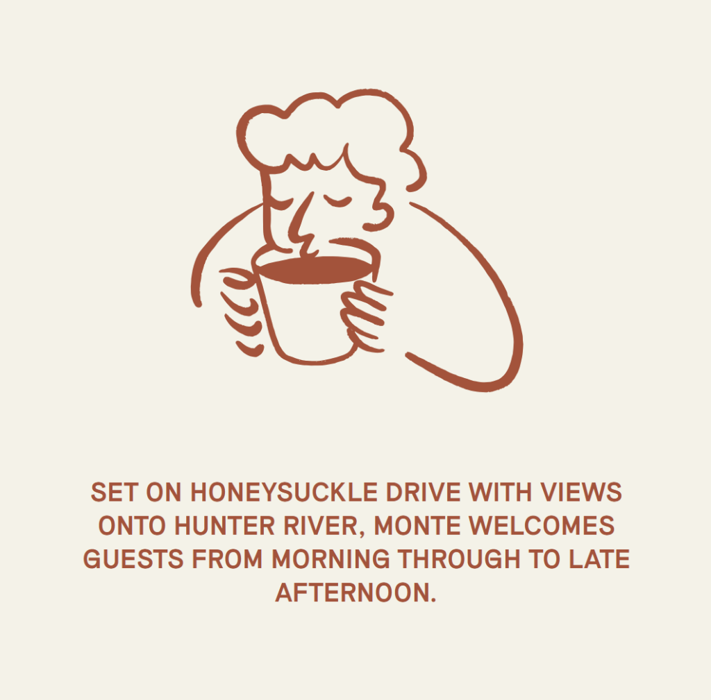
The illustrated animations blend seamlessly with text as they are all that same red colour although contrast just enough due to the difference in form from the uniform, sans-serif typeface and the organic sketchy illustrations. Another benefit of this minimal typeface is to give plenty of light to the Logo at the top of the page; as a purely text logo in the same colour as the other text, it’s at risk of being completely lost. This contrast between a lower case, serif font and the capitalised sans serif is very effective. This sketchy style of the animations really brings a handmade feel to the digital space which I love and would like to take inspiration from for my own works in the future.
Bondfire Inc.
Bondfire is a ‘branding and technology studio’ covering everything from brand strategy to branding and photography to web development.
as soon as you open this website it provides you with an unexpected and possibly unconventional experience. It is memorable.
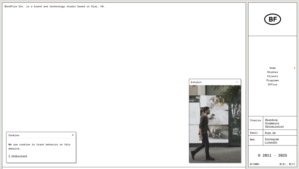
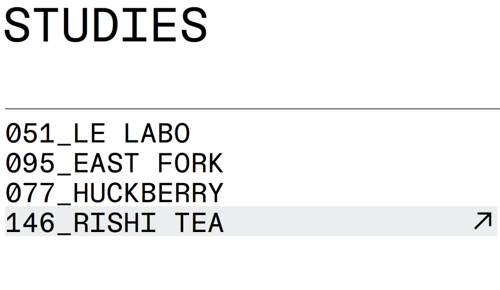
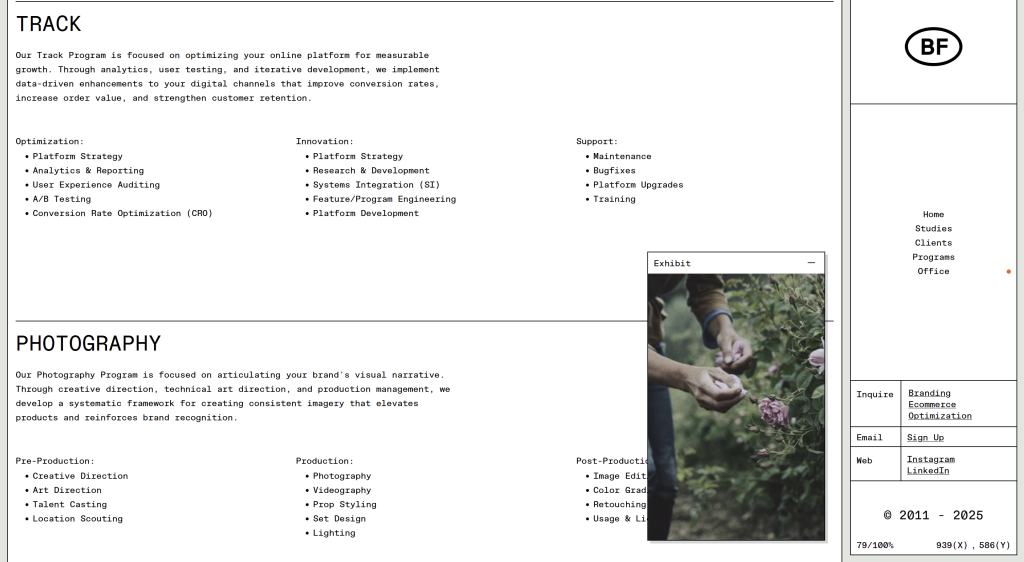
It challenges the expectations and borders of the common webpage; treating it more like an interactable interface rather than resembling a printed page. it does this by subtly mimicking someone’s personal file manager in details such as the names of studies typed out like file names.
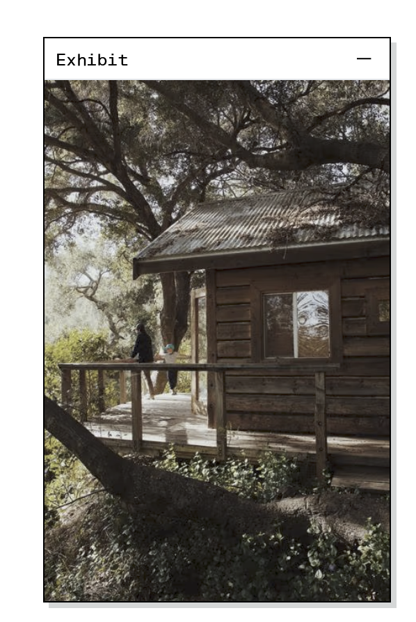
Features such as the separate tab for a slideshow of photography, really embraces the digital medium that it’s in. It also provides the user with a feeling of being in control of their experience as they can drag this tab around the page; it further immerses them into the web page. This tab will also remain on the users page wherever they are on the site – it stays still whilst you scroll, conveying the visuals of their brand whilst the user reads about what they offer.
This is the same for the standstill tab on the right side of the page. It contains the menu and all of the call to action buttons making them very easy to find which is ideal as the goal of their website is to guide potential customers to get in touch/sign up for their emails etc. These buttons can often be quite tricky to find on a more common laid out website or are often right at the bottom so it is refreshing to see them in a different format which I think makes a lot more sense.
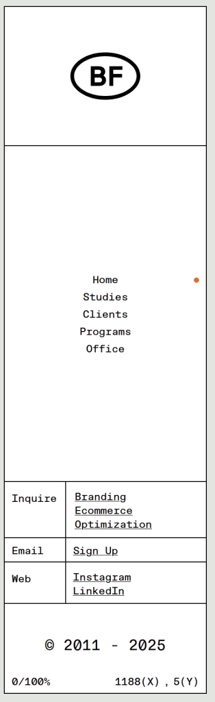
The use of ‘NT Bau Mono’ typeface throughout resembles those fonts often used to display code so effectively reflects the nature of their business around web development.
Overall this webpage is incredibly organised, minimal and neat. It’s stripped back to the basics which is what i really appreciate about it. The lack of animations and gimmicks also help with the accessibility side of it, allowing the code to be more focused on such things. The simplicity and boldness of the black on white make it very easy to read.
A Single Div
Created by developer Lynn Fisher, ‘A single div’ is a fun, experimental showcase of pixelated CSS art. Every illustration is crafted using just one <div> element.
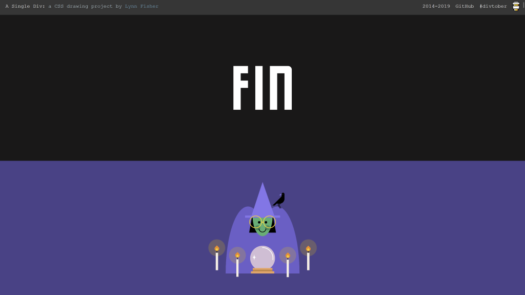
These works of art alone are so impressive but i also really appreciate the simplicity off the website they are displayed on. With its minimal header providing little to no distraction from the artworks themself and the fixed width, coloured blocks containing the images.

Every image stands out with the use of contrasting colours behind it.
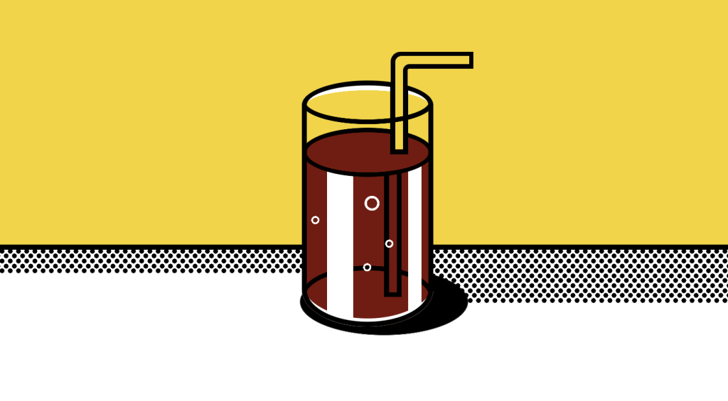

One thing I notice every time I open this site is how quickly it loads, even on mobile data with a bad signal. This makes the website accessible all around the world no matter the device or the country, despite how full of exciting visuals it is. Usually files would need to be optimised and would lose some of its quality in order for it to load so quickly on all devices. It is also extremely responsive; no matter the device, the illustrations are intact and displayed effciently in an organised manor.
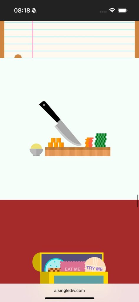
The results of illustrating with such constraints and pushing the boundaries of what can be done, produces a vector-like style of illustration that has a lot of charm and fits into the digital space seamlessly.
I find this technique of illustrating within CSS so fascinating and would love to try it out as a technique in the future for my own sites. Especially if it improves the worldwide accessibility of my sites.