For this project I created a website for the ficticious small business – Black Crag. The main focus was bringing customers into the store, so I kept this at the forefront of my design process.
The Research
I began this project with the most important part – the research. I used various UX techniques to gain a clear understanding of the user and their specific needs. My main takeaways included:
- Crucial information had to be very easy to find, especially on a phone as most people will be on the go when looking for a shop to visit.
- A friendly and welcoming atmosphere must be portrayed throughout to put people at ease.
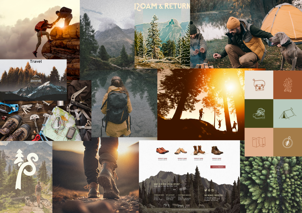
Once I knew who I was designing for, I wanted to get an overall feel for the business itself and get some ideas for the visuals of my site. I gathered inspiration and put a moodboard together.
I found this stage useful and excitinng, as I could start to see the brand come to life.
Design Considerations
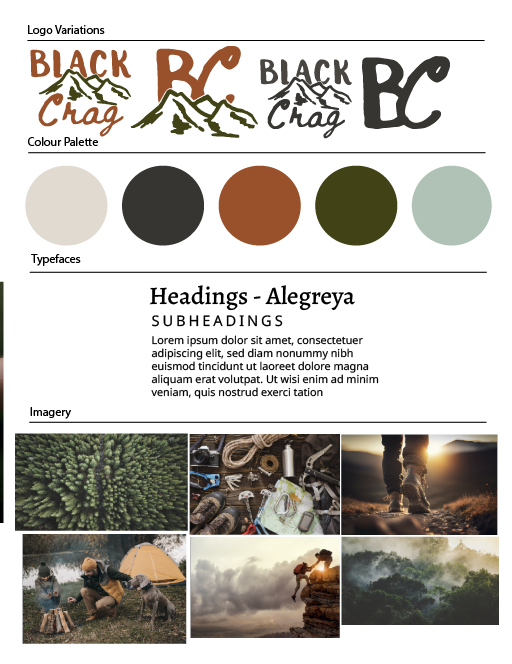
Creating the moodboard gave me a clear visual for the brand identity of Black Crag and led me to decide on design features. I wanted to create an overall warm and welcoming design that reflects the theme of nature.
Typography
I chose a serif font ‘Alegreya’ for my headings as I liked how organic and ‘inperfect’ it felt which suited the cosy nature theme. It has many options for font weight, which I made use of in my subheadings to differentiate them. For main body text I chose noto sans. As the heading font is quite heavy, I wanted a sans serif, easy-to-read font to contrast it.
Colours
I wanted to make use of cosy, warming colours that reflect the theme of nature. I went with a warm beige (#e0dad0) to use primarily for backgrounds and an warm dark grey (#373531) for main body text. These two paired together give my website a comforting feeling, I wanted to stay away from any harsh colours. For highlights and headers I chose a rust (#99512b) and a deep green (#414316). These two reflected the theme of nature and reminded me of the cosy autumn months which I hoped would bring the user a comforting feel.
Imagery
The imagery must match this comforting theme too. I chose some images showing outdoors activities to reflect what Black Crag is all about and inspire the customers to go on their own adventures (and buy their gear from Black Crag to do so).
A repeating theme that inspired me in my research was the illustrated elements. The contrast of rough sketches on a screen adds an organic feel that fits the theme I was aiming for. I made use of this technique on my website to add to the ‘cosy’ feel. If I were to do this again, I would spend a bit more time on these illustrations and create more of them. I would have them spread more evenly throughout the site and make them feel more cohesive with the overall design.
Content Out
Before beginning to design the website itself, I established what it was I was actually designing. Using this content-out approach allowed me to work out what pages would be most effective in bringing customers to the store, and what content would be most practical and helpful for the user. I decided to go with 5 pages:
- Homepage
- Our Story
- Find Us
- Events
- Get in Touch
Layout Design
I liked the process of designing within figma rather than directly on the web as it gave me a bit more creative freedom. Rather than focusing on what I knew I could do within CSS, I focused on what I actually wanted the page to look like. This forced me to learn new techniques such as the hamburger menu and sticky header. I would like to do more research into layout design in the future as it is not something I have had experience with prior to this project.


Conclusion
If I were to start this project from scratch I would do some things differently, I definitely learnt a lot from this process and look forward to creating another one. I would like to spend more time on low fidelity sketches to establish all my options for layout and gradually build towards fully completed pages. When creating this site I designed and built one section of a page at a time and I think that shows in my overall design accross the site. I would like to focus more on maintaining a consistent and cohesive design across all of my pages.