With the start of any project, research should be at the forefront of the process to ensure that the end product is user-centred.
Over the past few weeks, I have attended workshops by Steph Troeth and Chris How. These introduced me to user experience research and user-centred design, including how essential they are in the design and development process of any web project.
This article outlines how I plan to use UX research techniques to enhance the functionality and success of my small business website.
So, What is UX Research?
User Experience research is all about understanding the person on the other side of the screen. The person actually using your product, whatever that may be!
I cannot create a successful product without understanding the needs of my target audience. In 2018, a study claimed that ”17% of IT start-ups fail due to a lack of implementation of user-centred design.” (Viebrock, 2018)
This type of research includes an array of techniques, which should be used throughout the design and development process – keeping the user at the centre of the design process at all times. UX research helps to analyse the users’ needs and behaviors, ensuring a more seamless experience on the completed product. (Hudziy, 2025)
My Project
The project I am currently working on, which I will apply my new understanding of user experience to, is my small business website. I have been tasked with creating a website for ‘Black Crag’ – an in-person store selling all you need to enjoy the great outdoors, with a specific goal of encouraging people to return to the high street and visit the store.

My research aims to gain a clear understanding of who will use my website and how I can encourage them to visit the in-person store. A website can make or break a business today, so it is vital to apply UXD techniques effectively. One research article notes that ‘retailers need online/offline integration to better serve their clients’, and ‘90% of UK consumers first orient themselves online before buying the product in a physical shop’. (Moes, 2017)
Preperation
Preparation for research is possibly the most important part; it ensures that any research taking place is relevant. Before I dive into user personas and how-might-we statements, i need to establish a few things:
–Who is my target audience?
–What are my clients’ goals?
–How will my site be used?
My Target Audience
- Hiking enthusiasts
- Family’s looking to get outdoors more
- Elderly people wanting to maintain their fitness
- Young people who are just getting into hiking
My Clients’ Goals
- Get customers to the shop!
Use of Site
- Find out about products
- Get in touch
- Find the location/get directions
Research Canvas
My first step has been to fill out the research canvas, a document provided by Steph Troef to get an all-around understanding of my research goals. We were introduced to this document in our workshop for a case study on reducing single-use plastic. I found the process effective in allowing me to think from a user’s perspective rather than my own.
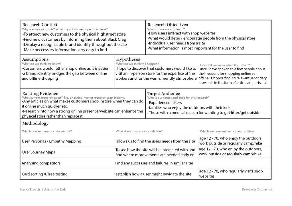
Completing the research canvas for my website has given me a broad understanding of which direction I need to be heading in and what research points and methods I should be using.
Who am I designing for?
User Personas
User personas were shown to us by Chris How. This is the process of creating fictional characters to represent the broad range of potential users that you are designing for. Creating these can help you to step out of yourself. (Dam and Siang, 2025)
By stepping away from my own thoughts as the designer, I put myself in the shoes of who we are designing for to establish their goals, needs, behaviours, and pain points.
I took some time to come up with three user personas for Black Crag:
- Damien Stevens: a 42-year-old busy working dad, wanting to take his kids camping on weekends.
- Sophie Turner: A 28-year-old outdoor enthusiast, who prioritises style and quality, frequently posting on social media.
- Alan Box: A 68-year-old retired teacher, trying to get frequent exercise outdoors to improve his health.


My main takeaways from this exercise are:
- The design of my website must be modern enough for a young, trendy audience to engage with, but also simple enough that a retiree like Alan can easily find the necessary information.
- It must be responsive! Most people will be viewing it on their phones, especially if they are out already and looking for a nearby outdoors shop to visit. There will still be many people accessing the site through larger screens at home before planning a visit.
- It is hugely important to portray a friendly and welcoming atmosphere, with the owner of Black Crag at the forefront. This will make customers who need reassurance and guidance more inclined to come in and visit.
Empathy Mapping

In our workshop with Chris How, he introduced us to the empathy map canvas shown above. This excercise is useful to move beyond demographics and capture the emotions of our user, so that we can play into this with the design.


I created empathy maps for each of my personas to explore how they think/feel, what they see, what they hear, and what they say/do. This exercise gave me an insight into my users from a different angle and allowed me to think about their journey on the website. I will use the insights from this when I begin creating user journey maps.
Assumptions and Hypotheses
Now that I have my target audience clearly mapped out, I can further my research with these fictional users in mind. Research hypotheses can turn your thoughts into something you can quantify and evaluate, not only whether an idea is worth pursuing, also how to go after it. (Tanovic & Whitman, 2024)
I assume that:
- Most customers need easy access to practical information (opening times, maps etc.)
- Customers want to be reassured that they will be welcomed to a friendly store.
Based on these assumptions, my hypotheses are:
- If practical information is clearly labelled/headed and easy to read, users will be more likely to visit the store.
- If the website portrays a friendly atmosphere, showing the welcoming face of the owner, customers will be more confident to visit the store.
By making assumptions, I could develop testable hypotheses, which I will use when conducting interviews/surveys to establish whether my assumptions were correct.
Job Statements
Job statements are a framework that we can use to form a statement about the user and what influences their way of thinking and acting.
- When I’m browsing the site, I want to see the store’s personality, so I can decide if it’s worth visiting in person.
- When I’m looking for somewhere to buy camping gear, I want to easily find clear directions to the shop, so that I can find it stress-free.
- When I’m shopping for new hiking gear, I want to know that someone will be able to provide me with help and guidance, so I am confident in my choices.
User-Need Statements
User-need statements focus more on the needs of the user rather than the job they want to complete.
- As someone just visiting the area, I need clear directions to the store and a visual brand to look out for, in order to easily find my way to the store.
- As someone who prefers to shop online, I need to understand what makes visiting the store better than ordering online, in order to decide if the trip is worthwhile.
- As a visually impaired user using a screen reader, I need the site’s layout to be semantic and all images to be properly labeled, in order to confidently plan my trip to the store.
Designing the User Experience
Timed sketches
Low-fidelity sketches are a great place to start when it comes to visualising ideas, and by timing them, I will be allowing myself to form more ideas. It is easy to think of one idea and then get caught up in it, not wanting to think of a different method. This is why using the ‘timed sketches’ technique can be so powerful to get ideas flowing.
Whilst you may be able to come up with a good design by developing a single idea, you will never know if you could have come up with something better, a more effective solution to your problem. (Rojas, 2023)
I will use this technique to create visuals and wireframes for Black Crag, and then I will use the SCAMPER method to further develop these ideas and guide the ideation process in other routes.
Card Sorting & Information Architecture

The next step will be for me to establish the information architecture, the structure of the site. To create the most effective layout of information, I plan to use the card-sorting method. This method involves writing all of the page names or topics for your site onto index papers, offering them to the test subject to organise them into categories that make the most sense to them. This gives the designers an insight into the users’ mental model, how they group information. In doing this, we can group content together according to how the user expects it to be grouped, resulting in a smoother navigation experience.
I will ask 5 friends or family members to complete the task for me, ensuring that I select individuals varying in age, sex, and occupation so that there will not be any biases in the data. This data will be qualititive and I will later analyse it to find any recurring patterns (or categories) which I can make use of when creating wireframes and an information architecture document.
Testing and Analysis Phase
At this stage, I should have a clear idea of my users’ needs, and some ideas for the design and structure of my site. I can begin the testing and analysis phase!
This phase involves many types of test methods to produce a variety of data: both qualitative and quantitative.
Quantitative data is in the form of one or more metrics to reflect whether the tasks were easy to perform. (Budiu, 2017)
Qualitative data consists of observational findings that identify design features as easy or hard to use. (Budiu, 2017)
Open-Ended Interviews
Using the content I gathered in the User Persona portion of this article, I will form questions to be used in interviews to provide me with data to validate my assumptions about the users needs. When writing these questions, I will be sure to maintain the main focus of encouraging users to visit Black Crag.
These questions could include:
- When browsing a shop’s website, what would make you want to visit that store in person?
- Is there anything on a brand’s website that would put you off from visiting in person?
Usability Testing
A large section of the analysis phase is the usability testing. This produces data on how usable the site is and ranges from low-fidelity sketched-out web pages to prototyped functional sites.

User Observation
Once I begin thinking about how my site will look and function, I will use the evaluative research method of user observation. This will be done by asking a few friends/family members/coworkers (again, ensuring I have a varying pool to reduce any bias) to navigate my website, completing a few set tasks such as ‘find directions to the shop’. I will observe their process, taking notes on everything they do whilst asking them questions like:
- ‘Is this what you expected to happen?’
- ‘What was going through your mind when you clicked that?’
After the observation process is complete, I will make use of the rose, bud, and thorn analysis method to analyse the data I produced.
- Roses — Good experiences & positive things.
- Buds — Opportunities for improvements.
- Thorns — Negative things & pain points.
This should prove extremely useful in finding any necessary adjustments at this stage. As the designer, I need to know how people who have never seen the website before will interact with it. They might not notice essential buttons/links, which will highlight a pain point in the site.
Conclusion
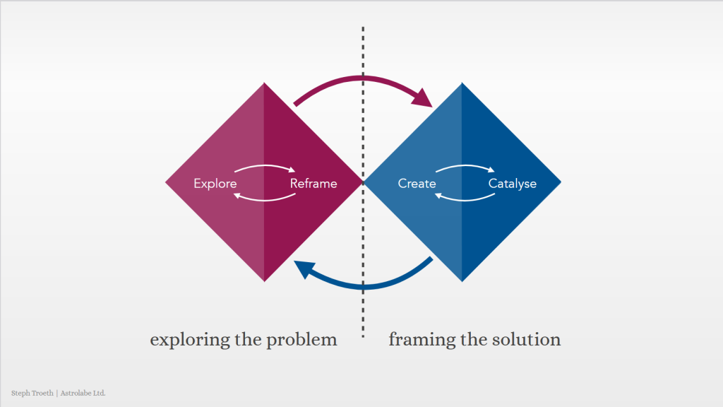
As my project evolves, so will my research. Steph Troeth introduced us to the double diamond – a diagram that illustrates design as a constant cycle of exploring the problem and framing the solution. UX research will be at the forefront of my mind for the entirety of the design process, and I will regularly return to the research stage to gather new insights as required. By keeping the user involved at all times, the product can continuously be changed to meet their needs – after all, I am designing for them.
Exploring User personas and UX methodology has given me a clear understanding of who I am designing for, and I now feel more prepared to move forward into the next stages of my project: the design phase and the analysis phase. By taking the time to gain insights into my user, I will produce a site that portrays Black Crag as a warm and friendly shop to visit, with a seamless user experience.
References
- Viebrock S. (2018) User-Centered Design: Principles, Process, and Examples. O8 Agency. Available at: https://www.o8.agency/blog/user-centered-design-principles-process-examples (Accessed: 17 December 2025).
- Adobe Stock (2023) Equipment necessary for mountaineering and hiking. [Online image]. Available at: https://stock.adobe.com/uk/contributor/204563649/gilitukha?load_type=author&prev_url=detail&asset_id=94028048 (Accessed: 19 December 2025).
- Troeth, S. (no date) The research canvas template. Available at: https://maweb.design/resources/user-experience-design/User-Research-Fundamentals.pdf (Accessed: 17 December 2025).
- Dam, R. F. and Teo, Y. S. (2025) Personas – A Simple Introduction. IxDF – Interaction Design Foundation. Available at: https://www.interaction-design.org/literature/article/personas-why-and-how-you-should-use-them (Accessed: 17 December 2025).
- Hudziy, O. (2025) What Is UX Research and How it Drives Effective Design. Available at: https://quarte.design/blog/what-is-ux-research-and-how-it-drives-effective-design (Accessed: 17 December 2025).
- Moes, A. (2017) ‘The online appeal of the physical shop: How a physical store can benefit from a virtual representation’, Heliyon, A Cell Press Journal, Volume 3, Issue 6
- Shanovska, K. (2025) User personas
- Innovation Canvas. (no date) Empathy Map [Online image]. Available at: https://www.innovationcanvas.ktn-uk.org/resources/empathy-map (Accessed: 19 December 2025).
- Shanovska, K. (2025) Empathy maps
- Tanovic, A. and Whitman, L. (2024) Creating a research hypothesis: How to formulate and test UX expectations. Available at: https://maze.co/blog/research-hypothesis/ (Accessed: 17 December 2025).
- Rojas, J. (2023) Learn How to Use Sketching as an Ideation Method. IxDF – Interaction Design Foundation. Available at: https://www.interaction-design.org/literature/article/etch-a-sketch-how-to-use-sketching-in-user-experience-design (Accessed: 17 December 2025).
- UX Indonesia. (2020) someone using the card-sorting method [Online image]. Available at: https://unsplash.com/photos/person-holding-white-printer-paper-WCID2JWoxwE (Accessed: 19 December 2025).
- Kalwani, V. (2021) Illustration of usability testing taking place [Online image]. Available at: https://usabilitygeek.com/remote-usability-testing-best-practices/ (Accessed: 19 December 2025).
- Budiu, R. (2017) Quantitative vs. Qualitative Usability Testing. Available at: https://www.nngroup.com/articles/quant-vs-qual/ (Accessed: 17 December 2025).
- Troeth, S. (no date) The double diamond [Online image]. Available at: https://maweb.design/resources/user-experience-design/User-Research-Fundamentals.pdf (Accessed: 19 December 2025).