Colour Schemes
This week we’ve dug into how a colour scheme can transform a site and portray a mood or theme.
adobe colors
Prior to this week, i was using the site ‘coolours’ for creating and browsing colour palletes. However, i’ve now discovered adobe colors and found it much more useful. I’ve used it extensively this week to browse colours by theme and get inspiration as well as create my own colours. It’s a great resource for making little tweaks to colours until I visually find the theme i want.
My website
—
Folder Organisation
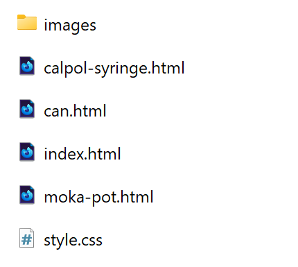
I have been adding all the different versions/stages of my three designed object site on my coursework page which has involved a lot of folder reorganisation.
This proved a good oppurtunity to make sure all my files to date are as organised and functionate as they could be.
I stumbled into a few issues a long the way such as my images not showing up on my different site versions but realised that this was due to needing copies of the image folder within every site folder.
I now feel I have a strong understanding of folder organisations for growing sites which is going to come in handy for all the sites I hope to create. I made use of the helper page on the course site.


CSS
nth of type
terxt underline offset
decrease line height for headers
Media Queries
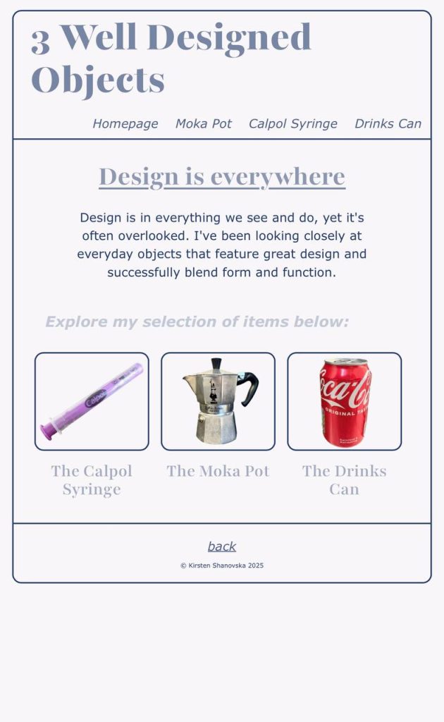
I took a bit of time this week to understand media queries. My site previously was not acting as I wouldve liked it to on a mobile phone or on a smaller browser window. The text was too small, and images displayed in a row which is more shaped for a landscape orientation screen.
Using media queries, I fixed the nav bar so that instead of wrapping when the viewport shrunk, they would shrink down. This kept them in one bar, improving the overall appearance of the site and maintaining the layout.
Longterm, i would like to learn how to change the style of my navigation to a hamburger drop down menu when viewed on a phone but I am happy with this design for now.
The next thing i adjusted was the figures. I created a media query with the max-width 1000px, changed the display to block which removed the ‘inline block’ that displayed them in a row.

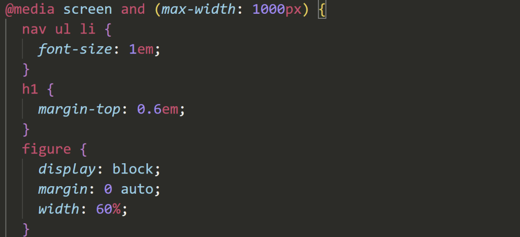
Next, editing only the media queries, I changed the % of the paragraphs so they would fill out the gap between the margin and text which was too much on a phone. This change enhanced the readability.


Going Forward…
Next week, I would like to rethink my colours as I’m not 100% happy with them. I will work on making them more bold and readable.
Sites mentioned
- Adobe Colour –
- design for web –
- Folder organisation – https://maweb.design/helpers/pages/06-file-and-folder-organisation.html
