This week we have been focusing on colour. This is probably my favourite aspect of design, a colour scheme can transform the overall feel of the website. it’s often the first noticable thing and is a very powerful tool.
Openfield Domains
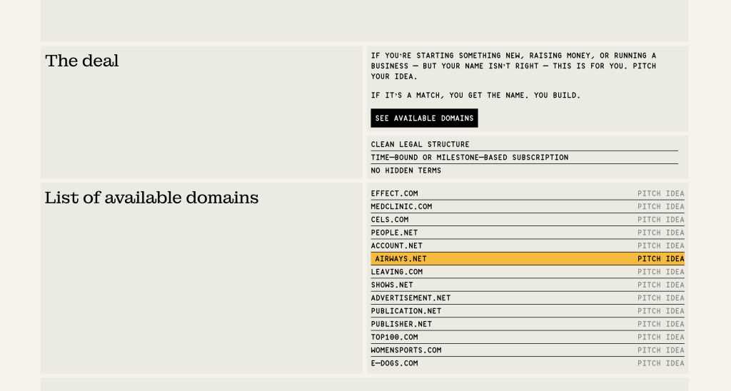
Openfield are a company selling domains. Their website’s colour scheme struck out to me for the subtlety of it. using mostly muted colours and solid black text, the singular yellow colour really holds a lot of visual power. It is easy to over do it when it comes to colour; i think this is a great example of less is more.
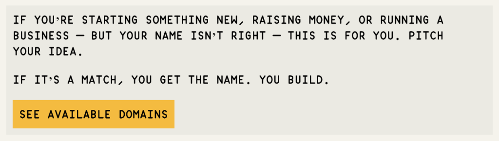
The bold mustard yellow colour is used on all the ‘call to action’ buttons or hovers. This works very well to draw the users eye to these elements. The background tones are warm colours, so the yellow doesnt feel out of place either, they balance each other out perfectly.

Occasionally, subtext is displayed in a warm gray colour, blending into the background and lowering the visual intensity. It is used very minimally though which is important for visual clarity.
Dianas Seafood
dianasseafood.com
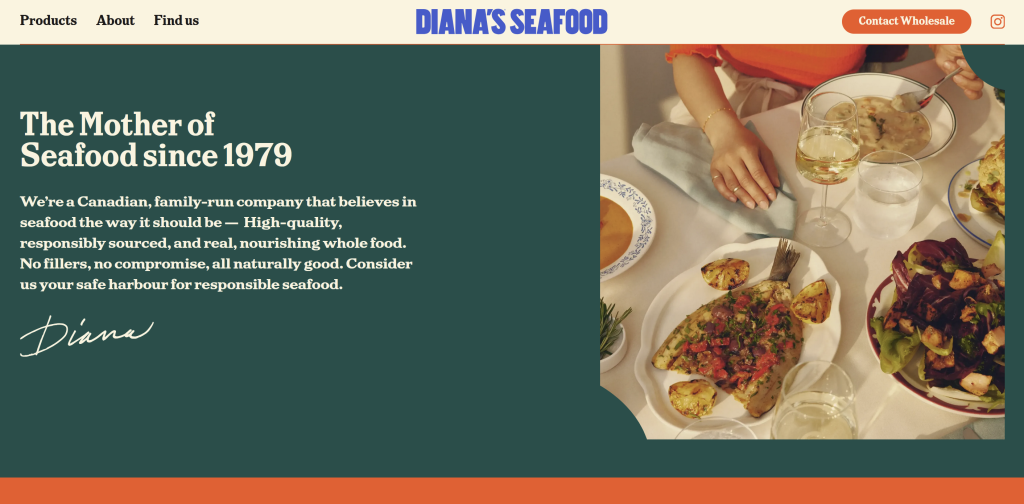
Diana’s Seafood is an online family-run storefront selling seafood. Their website is an example of how multicoloured websites can be done in a smooth and stylish way.
Seafood would generally give off cool tones i think, but they have created a colour scheme that is so warm and gives off the family theme of the brand whilst still feeling very ‘seafoody’.
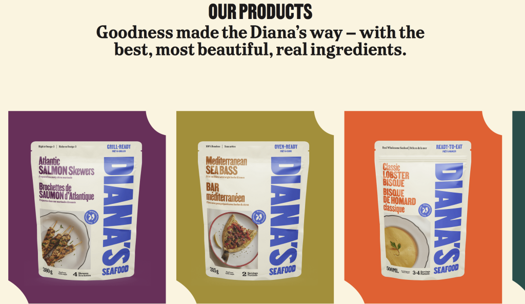
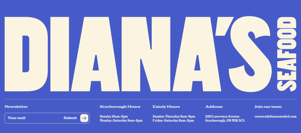
There are 5 bold colours used on top of the creamy background. This would usually be way too chaotic but they have made it work by using solid black for the text, or using that same cream background cream colour where appropriate for less important texts.
The bold colours they have used reflect the products theyre selling, like the lobster red and sea bassy golden yellow.
Better Than Good
betterthangood.xyz

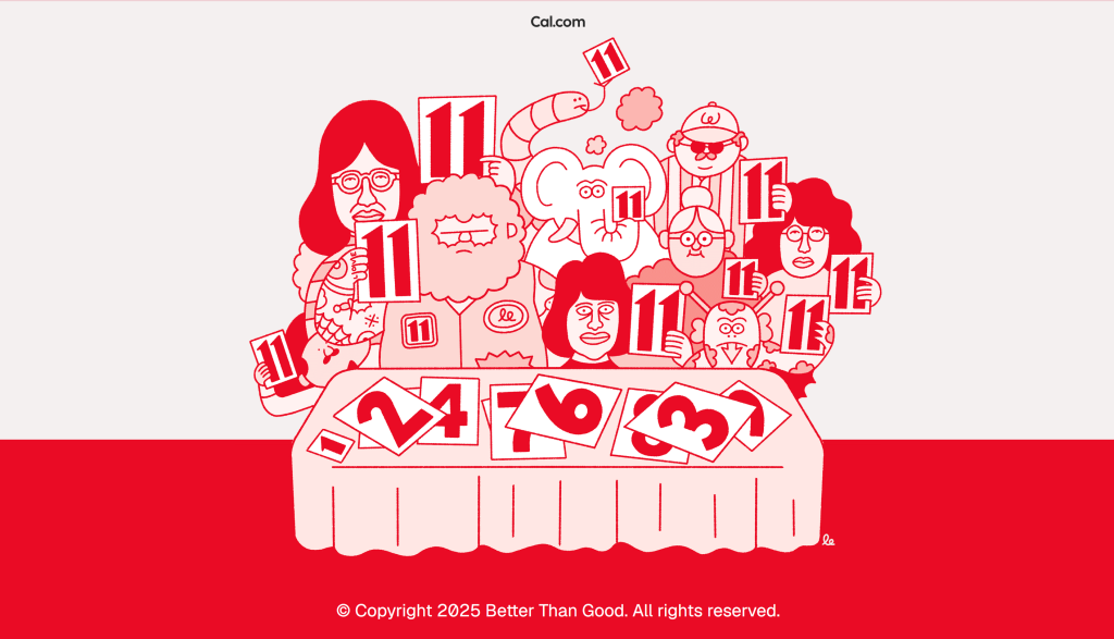
Better Than Good is the digital workshop and design portfolio. The colour scheme is similar to that of Openfield’s; they’ve used solid black and white and complimented this with one bold colour. I like that with Better Than Good’s site, they have used varients of the red, and used a very muted down version as part of the background at times.

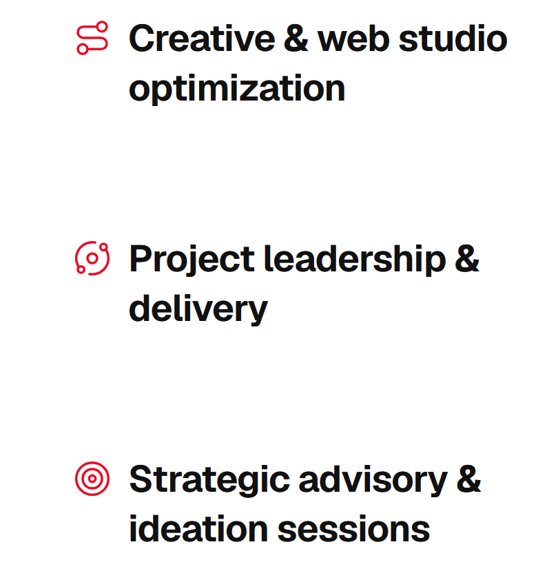
The bright red has also been used as a hover effect on links, which stands out so powerfully against the crisp white background and makes it super clear that these are links. The colours been dotted around the site in elements such as arrows and icons/illustrations. It allows everything to seamlessly blend together.